Multi-omics data integration Mechanism Diagram
Create a clear multi-omics data integration mechanism diagram for papers, PPT slides, research summaries, and molecular and omics education. Start from a reusable prompt and adapt it to your own pathway.
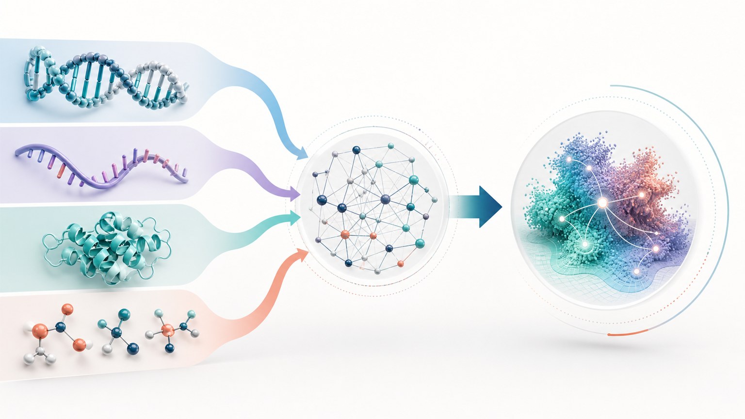
What this mechanism diagram shows
This multi-omics data integration mechanism diagram turns the homepage example into a searchable, reusable scientific figure page. It is designed to help readers understand the mechanism structure before generating their own version in MechFig.
- 1Genomic, transcriptomic, proteomic, and metabolomic data are quality controlled
- 2normalized and aligned
- 3integrated into a cross-layer network
- 4interpreted as biological hypotheses
Reusable prompt
Paste this into MechFig, then replace the ingredient, pathway, or target tissue with your own research context.
Layered multi-omics network diagram, colored data streams converging into an interpretable systems-biology model; vector only, no people.. Scientific content: Genomic, transcriptomic, proteomic, and metabolomic data are quality controlled → normalized and aligned → integrated into a cross-layer network → interpreted as biological hypotheses.
Embed this mechanism diagram
Copy the HTML below to include descriptive image text and attribution back to this example page. Confirm that your use complies with applicable rights and site terms before publication or commercial use.
FAQ
What should a multi-omics data integration mechanism diagram include?
It should include the starting trigger or input, the major pathway nodes, directional arrows between steps, and a concise endpoint that explains the biological meaning.
Can I use this as a starting point for my own figure?
Yes. Use the prompt as a structure, then replace the pathway, ingredient, disease context, or endpoint with your own research content.